Modern Maya
This is part of the Modern Maya cd rom project that I did for MacDuff Everton. The design is mine, the Macromedia Director work is Sky Bergman's, and the Images are Macduff Everton's.
This project involved a lot of image scanning, and some adjustment for the transition between print and digital media.
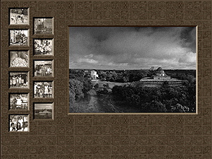
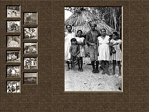
The fun part was actually designing the look of the interface. There were a number of sections of info, consisting of between 8 and 11 photos each. Of course, things would have been easier if there was a static number of images.
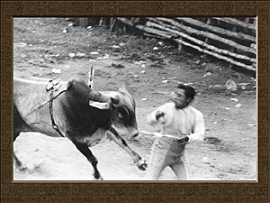
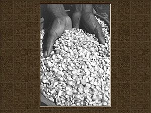
Thumbnails of the images had to appear on the left, with a larger default image on the right. As the user moused over the thumbnails (which were sepia toned) they would become black and white, and the larger image on the right would change to reflect the users actions. Clicking on the small image resulted in the small images disappearing, and the large image being replaced by an even larger image.
The design, other than being affected by the shape of the photos, was determined by the feeling we were trying to convey.
The background on all the pages is a tiled set of mayan glyphs, muted into brown tones to keep them from overwhelming the layout. The glyphs added a texture to the page that was very much necessary to make the project look Mayan.
The choice to make the project look like a set of bevel matted photographs, gives the layout more of an elegant feel.
I would have liked to add the element of sound and voice to this project, but being that it was a prototype, we did not have the budget to do so.
